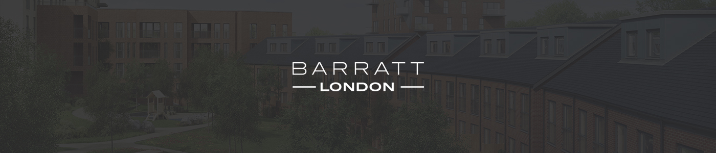
Barratt London
Digital brand guidelines
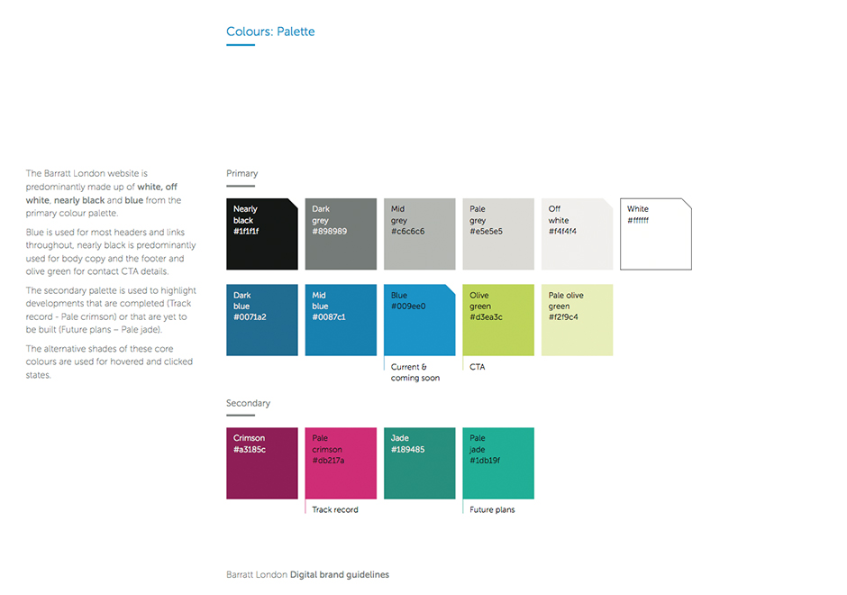
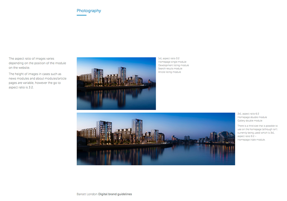
Alongside working on the new Barratt London responsive website, we were tasked with reviewing and creating a new brand identity for them. In terms of colours I made the decision not to stray too far from Barratt London's original colour palette of the primary black and secondary white due to all the marketing suites and off line collateral that they weren't planning on updating at the time. In order to reinvigorate it we reversed the primary black to white and the secondary from white to black which really freshened it up.
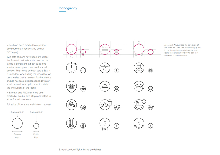
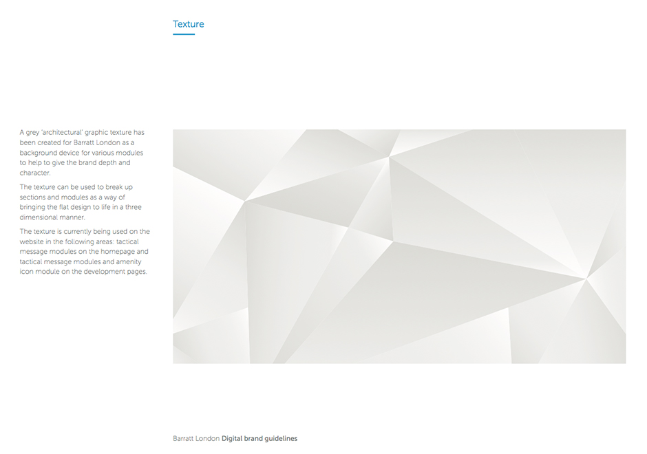
In addition we introduced a new set of colours which helped to distinguish live and coming soon developments from their track record and future plans. To accompany the new branding we also introduced a new iconography set and graphical background elements.