Barratt London
Branding
Responsive website design
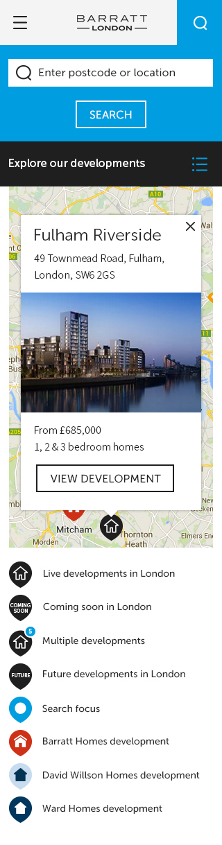
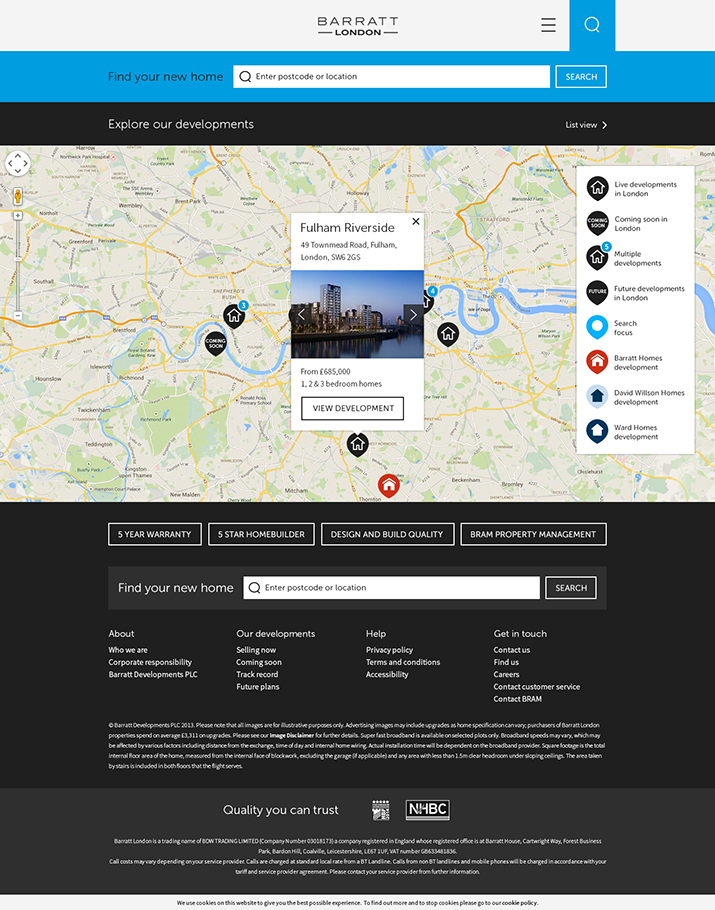
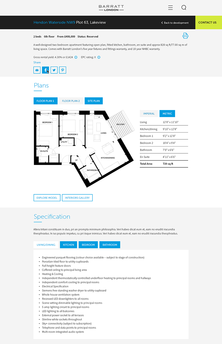
Barratt London came to Zone with 24 separate live websites which contained an array of important information such as live, coming soon and track record developments to news, media and their BRAM (Barratt Residential Asset Management) offering which made for a disrupted user journey. They wanted everything to be collated into one fully responsive, engaging website, whilst setting themselves apart from the competition in what has become a heavily populated housing market, as well as – and most importantly – improving lead generation.

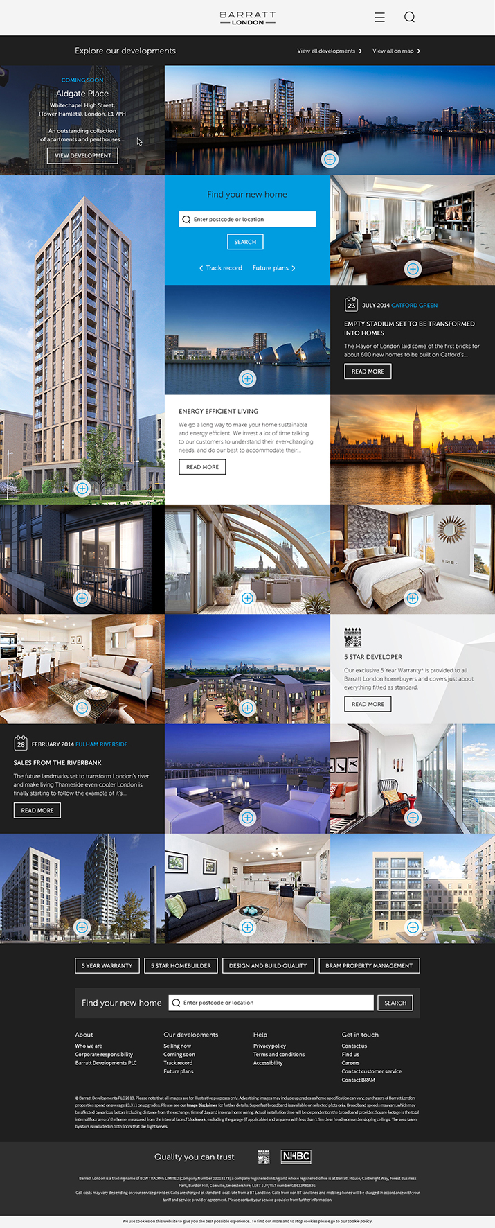
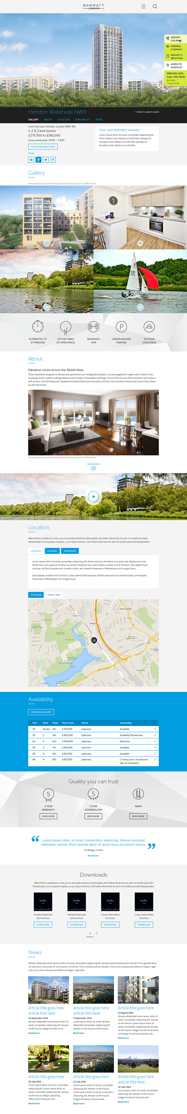
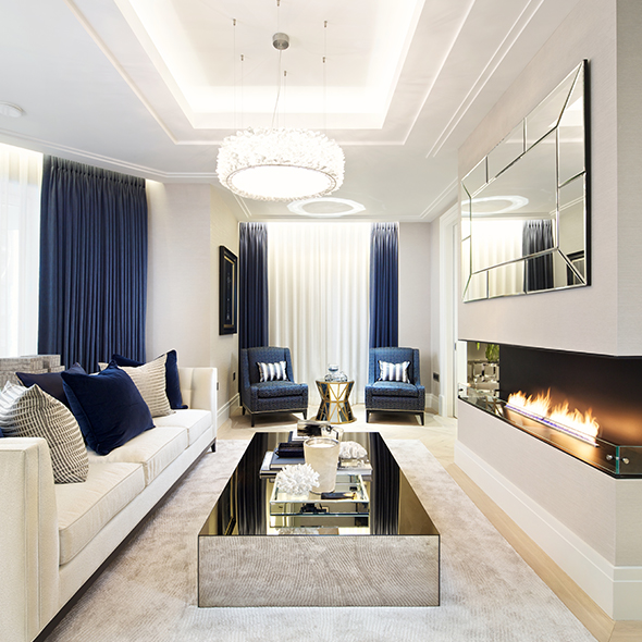
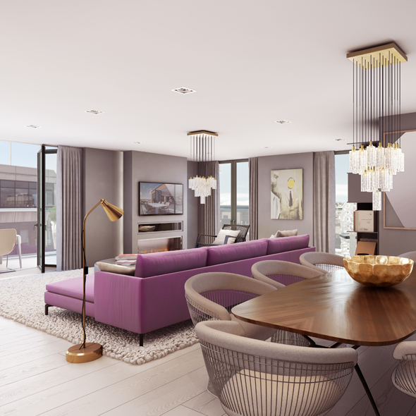
Designing the site included creating a new brand identity for Barratt London including a fresh colour palette I made the decision not to stray too far from Barratt London's original colour palette of the primary black and secondary white due to all the marketing suites and off line collateral that they weren't planning on updating any time soon. In order to revitalise it we reversed the primary black to white and the secondary from white to black which really freshened it up. In addition we introduced an new set of colours which helped to distinguish live and coming soon developments from their track record and future plans. To accompany the new branding we also introduced a new iconography set and graphical background elements.

Zoe consistently produces work of an outstanding quality. She is easily able to answer a huge variety of briefs, remains calm under pressure and is able to present her work to clients and receive feedback with complete professionalism. She is an absolute powerhouse and a catalyst for moving things forward in a positive direction.
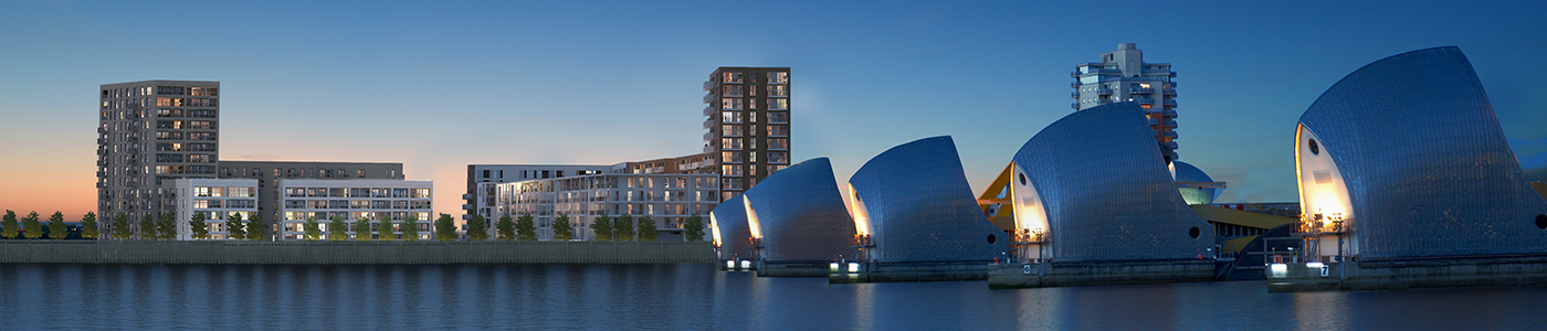
We came up with a set of design principles that the site should adhere to following user research and client workshops: breathtaking first impression, show that we 'get' London, be brilliant story tellers and made for mobile. The new site caters for all audiences and the full lifecycle of a development. It is flexible in terms of content and allows for great storytelling in it's structure. The in-page sticky navigation helps the user to move around the developments with ease and speed.
to development pages. Plus, over 7 minutes dwell time on premium developments (Baseline: National average 6 minutes 18 seconds), stronger SEO for single site rather than divided among micro sites and a DADI award nomination for visual design.