Bluebells of Henley
Branding
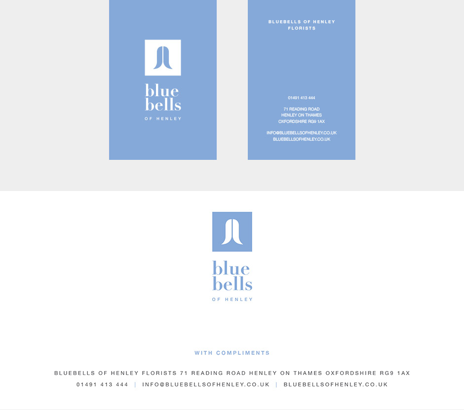
Stationery
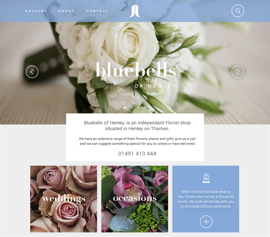
Website design
Bluebells of Henley came to me for a brand identity that would set them apart from their local competition but also work well within it’s surroundings of the lovely town of Henley-on-Thames.
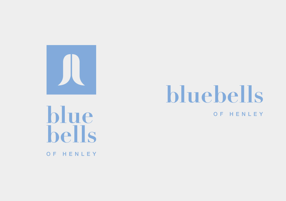
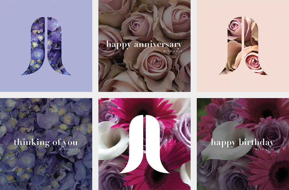
A clean, striking and bold graphical icon represents the bell of the bluebell flower head. An instantly recognisable icon that could be used as a stand alone graphical element on collateral such as personal message tags or as a small repetitive pattern on tissue paper or wrapping. The simplicity of the bluebell device also meant it could be used in a positive or negative way along with beautiful photography of flower arrangements taking it away from it's original flat format and incorporating texture to bring it life.


We are delighted with our new branding. Zoe is a very professional and dedicated designer, she listens to the brief so she really understands what is needed. She liaised with the printer for our headed paper and business cards and for the printing on our blind and vehicle. The whole process was very smooth and efficient.